
2021
Branding, Illustration, Web Design
Farmacy Food
WHO
I worked with three other designers to create branding elements for Farmacy Food, a health food company based in Detroit.
WHAT
As a team, we did research to understand how the existing Farmacy Food brand is perceived. We came to the conclusion that the company’s goal of being a close partner in its customers’ health journeys was not coming across well. Farmacy Food was perceived as being a clinical, impersonal pharmaceutical company. Instead, we needed to convey a more accurate tone—Farmacy Food is a warm, inviting brand that offers creative, delicious meals.
HOW
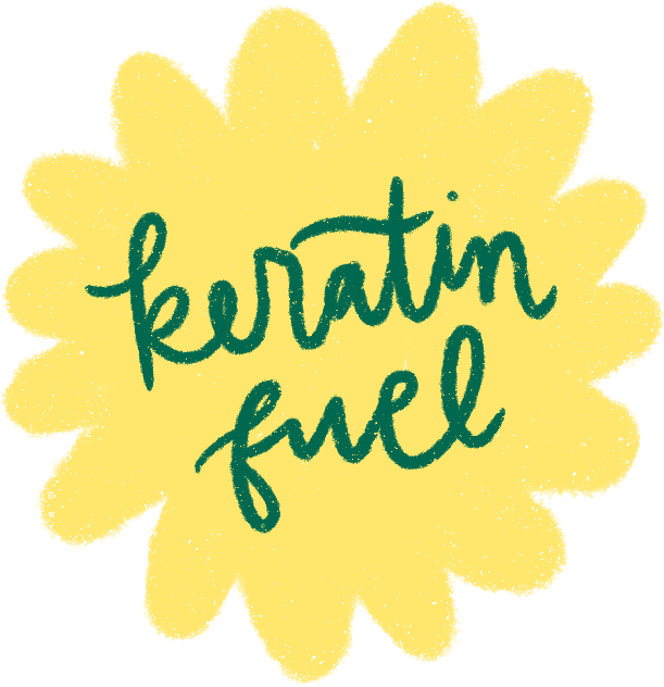
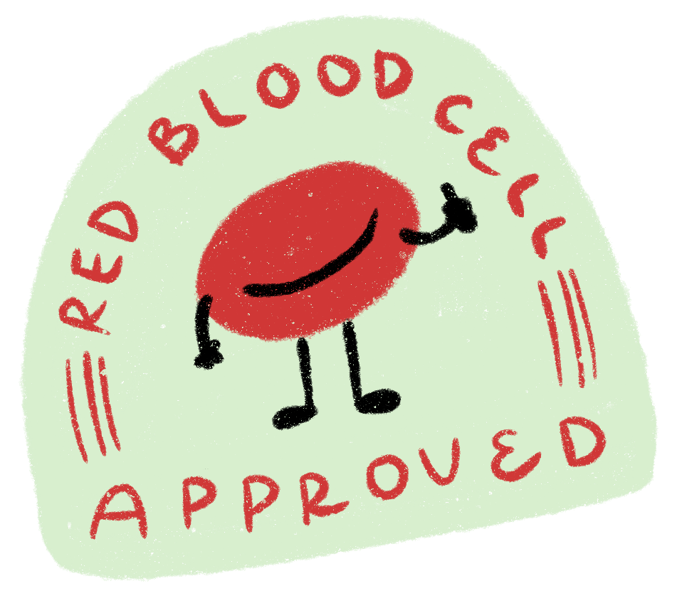
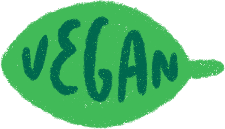
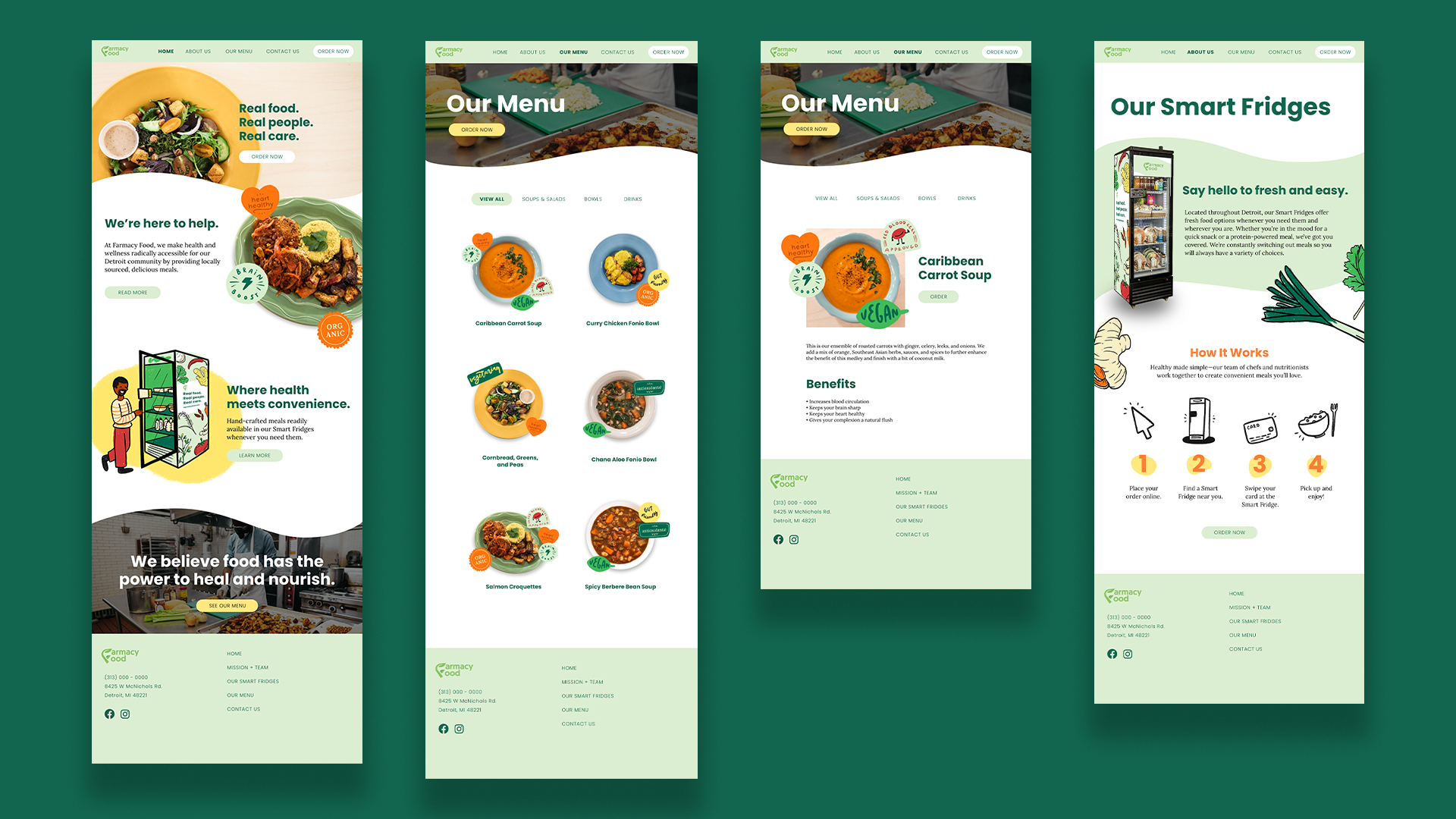
Hand-drawn illustrations and friendlier language immediately give Farmacy Food a more welcoming presence. Instead of sticking to the existing color palette of grass green and white, we chose to add bright orange and yellow, inspired by fresh ingredients, to compliment softer tones of green. The health benefits of each meal are highlighted in badges with catchy phrases like “Brain boost!” or “Keratin fuel".”
WHY
Since Farmacy Food’s meals are all hand-prepared, the ingredients are drawn in a style that reflects that, with texture and a certain human messiness.
“Benefit Badges” concisely inform on what consumers can expect each meal will do for their health—gone are lengthy, medical-sounding descriptions, now a hungry patron can easily understand their food is heart healthy at a glance.
Using first-person language helps push the personal aspects of Farmacy Food and reassures that this brand genuinely cares about its customers.
The website combines all these elements in a simple layout that greets users with lively curves and colorful visuals as they scroll through.